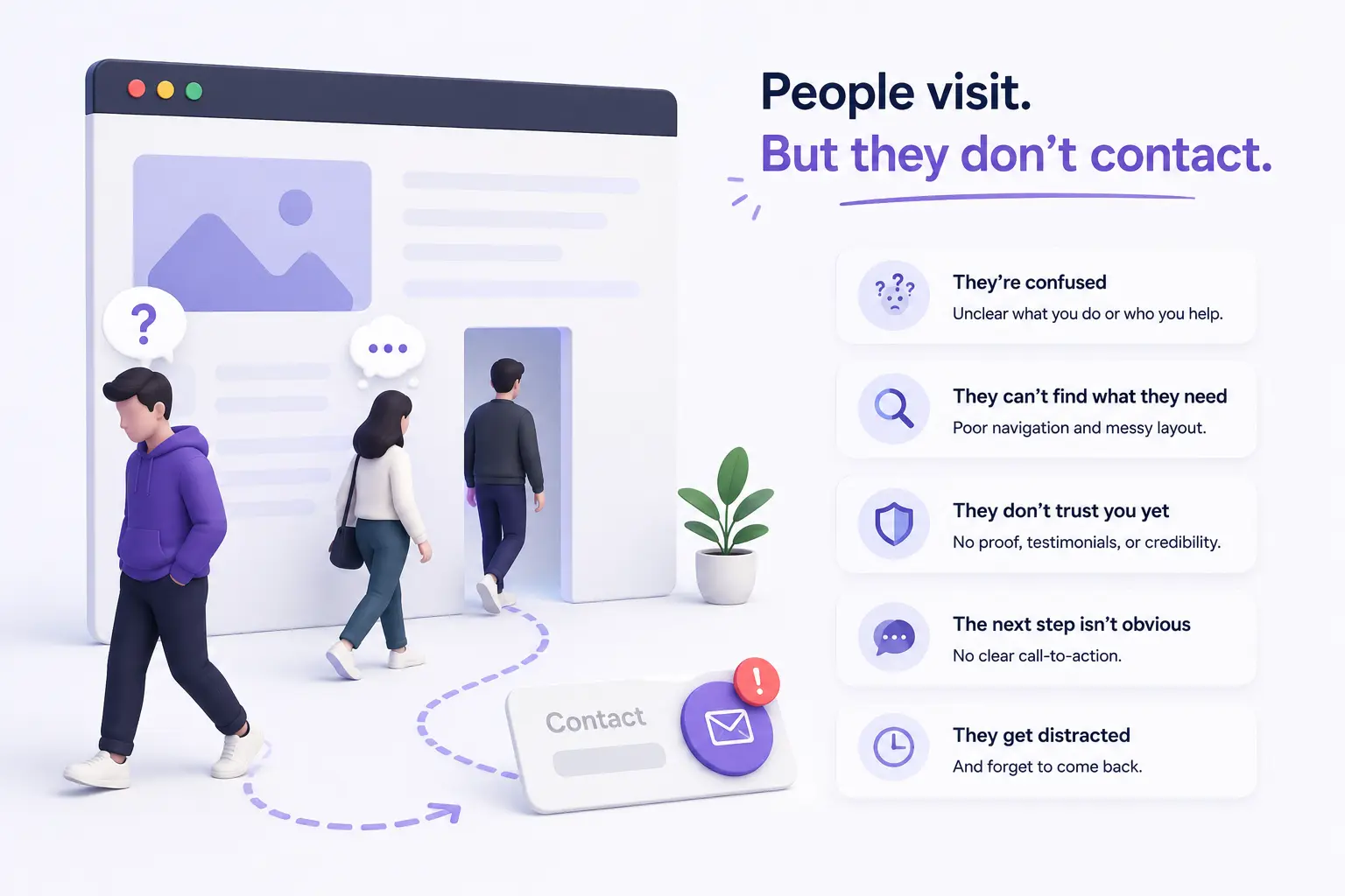
Imagine this: you check your website analytics and the numbers actually look decent. A few hundred visitors last month. People are finding you, spending a minute or two on your pages, and then — nothing. No calls. No form submissions. No WhatsApp messages.
You’ve probably experienced this and assumed the visitors just weren’t serious, or that the traffic was the wrong kind. The frustrating part is, that’s rarely the real reason. Most of the time, the visitors were interested enough to land on your site and stay for a moment. Something on the site itself quietly talked them out of getting in touch.
Here’s what usually happens — business owners spend most of their energy getting people to the site and almost none thinking about what happens once someone actually arrives. The result is a website that attracts attention but converts almost none of it into actual enquiries.
Why Website Visitors Leave Without Contacting Small Businesses
Most business owners assume that if someone visits their website and stays for a minute, they’ll naturally find a way to get in touch if they’re interested. In reality, visitors are impatient, easily uncertain, and almost never motivated to work hard to find contact information or figure out what to do next.
Imagine a local interior designer whose portfolio looks genuinely impressive. A potential client lands on her site, scrolls through a few project photos, feels genuinely interested — and then can’t immediately find a clear answer to “how do I actually hire this person?” There’s no obvious button, no pricing range, no simple next step. The visitor clicks away not because they lost interest, but because the next step wasn’t clear enough to bother figuring out.
This happens because websites are often built to look good rather than to guide a visitor toward a specific action. Good design without a clear path is like a well-decorated shop with no visible checkout counter — people look around and leave without buying.
How Do You Know If Your Website Has a Conversion Problem
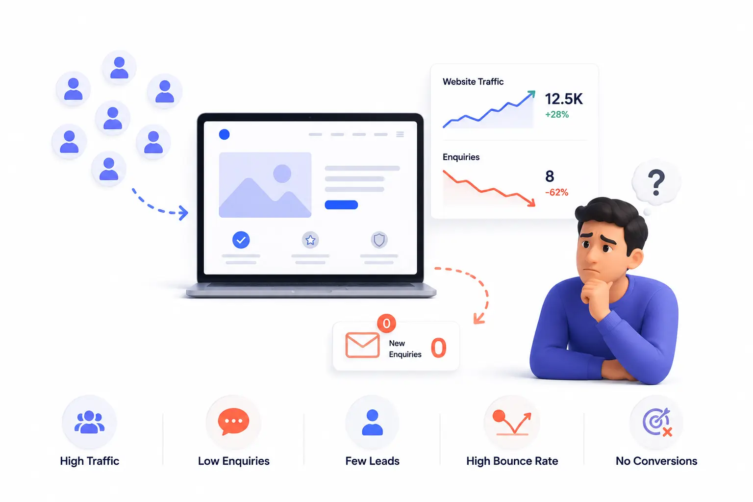
Sometimes low enquiries mean low traffic — not enough people are finding the site. But if traffic exists and enquiries are still low, the site itself is usually where the problem lives. Some signs:
- You get occasional visitors but your contact form, email, or WhatsApp rarely gets messages from the site
- Your website has no single clear “contact us” or “get a quote” call to action that’s easy to spot
- Visitors spend time on the site but leave from the homepage without going deeper
- Your contact page exists but it’s buried in the navigation or requires filling in too many fields
- You’re not sure what action you actually want visitors to take when they land on your site
Imagine a small accounting firm with a clean, professional website. Analytics show visitors landing on the homepage, scrolling part-way through, and leaving. There’s no obvious button inviting them to book a consultation. The phone number is in the footer, two scrolls down. For a visitor who isn’t already committed, that amount of friction is enough to lose them.
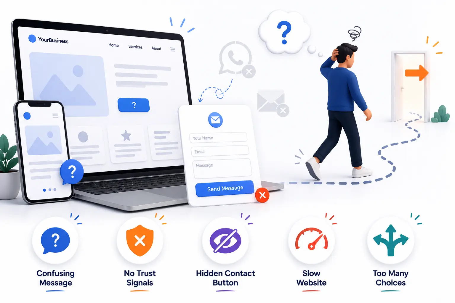
Common Website Design Mistakes That Stop Visitors From Making Enquiries
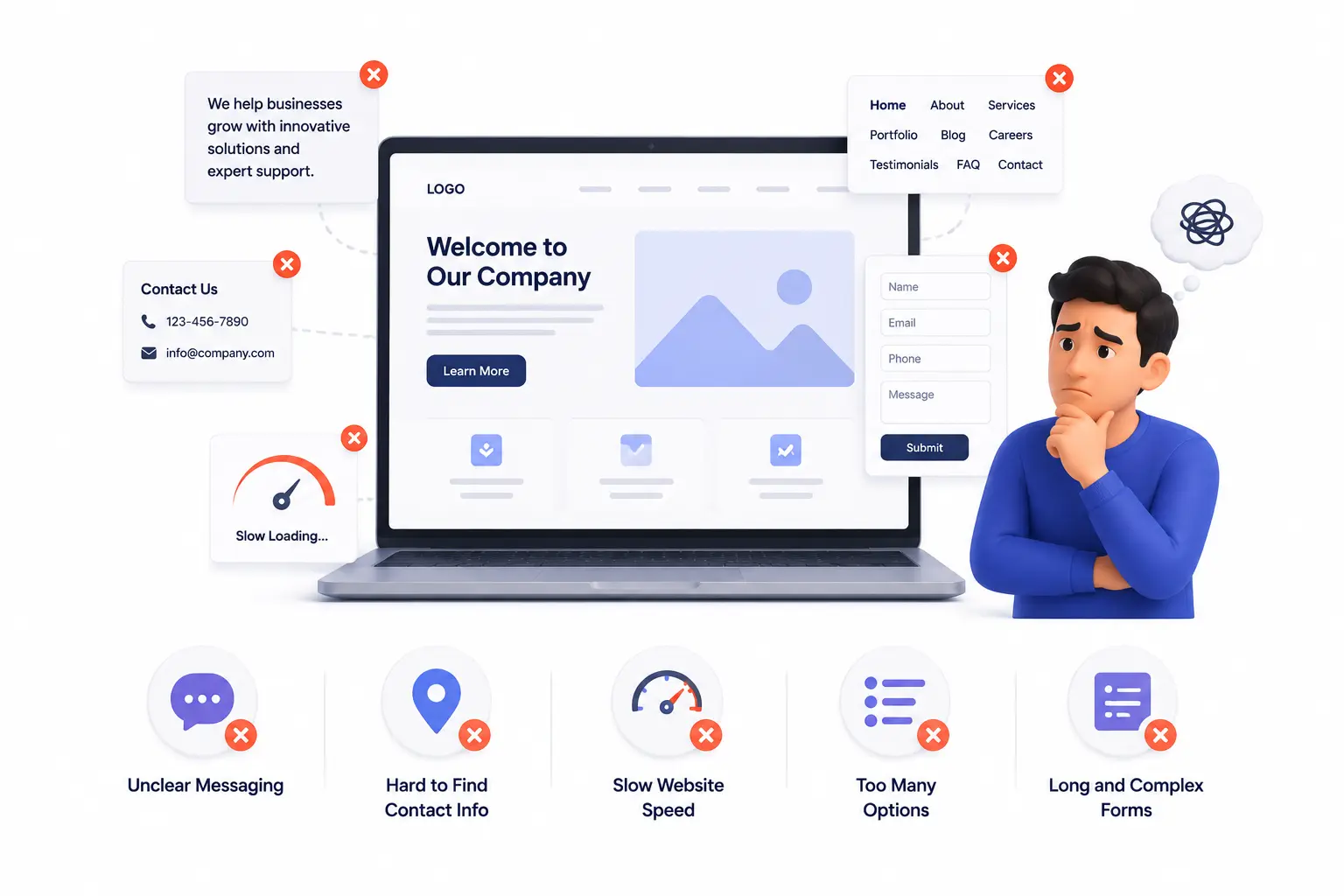
- No clear call to action on the homepage — visitors don’t know what you want them to do next
- Burying contact information in the footer or on a separate page that requires navigation to find
- Asking for too much information in a contact form — every extra field reduces the chances someone completes it
- Vague service descriptions that don’t help visitors quickly understand if you can solve their specific problem
- No trust signals — no reviews, no testimonials, no photos of real work, nothing that helps a first-time visitor feel confident
- Slow loading speed, which causes impatient visitors to leave before the page even finishes appearing
Imagine a freelance photographer whose website is genuinely beautiful but has a contact form with eight required fields — full name, phone, email, project type, budget range, date, location, and a free text box. Most visitors who would have sent a quick message give up halfway through filling it in.
How to Fix a Website That Gets Traffic But No Enquiries
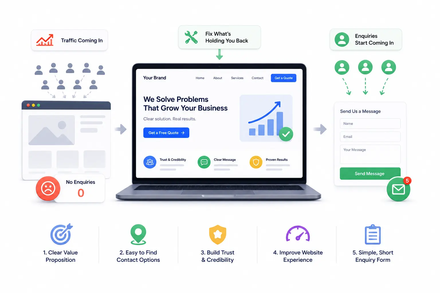
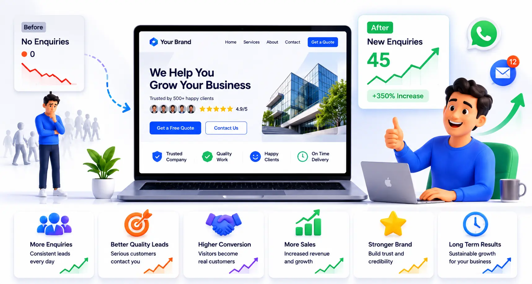
1. Add one clear call to action above the fold.
“Above the fold” means the part of your homepage visible without scrolling. If there’s no obvious button or link prompting visitors to take a next step — “Get a Free Quote,” “Book a Call,” “WhatsApp Us” — right there in that first screen, many visitors will never go looking for one.
2. Make your contact details impossible to miss.
Phone numbers, WhatsApp links, and email addresses should be visible without scrolling or clicking through to a separate page. If a visitor has to hunt for a way to reach you, most won’t bother.
3. Simplify your contact form.
The shorter the form, the more people complete it. For most small businesses, name, phone number or email, and a one-line message is enough to start a conversation. Everything else can be asked once you’re actually talking.
4. Add real trust signals near your call to action.
A short testimonial, a photo of actual completed work, or even just displaying how many clients you’ve served gives a hesitant visitor enough reassurance to take the next step. Imagine a tutoring centre that adds three parent reviews directly next to their “Book a Trial Class” button — the enquiry rate improves simply because the trust and the action are now sitting next to each other.
5. Write service descriptions that speak to the visitor’s situation.
Instead of “We offer professional web design services,” try “We build websites for small businesses in [your city] that are easy to update and actually show up on Google.” That specificity helps a visitor self-identify — “that sounds like exactly what I need” — which is the moment enquiries happen.
What Most Business Owners Overlook
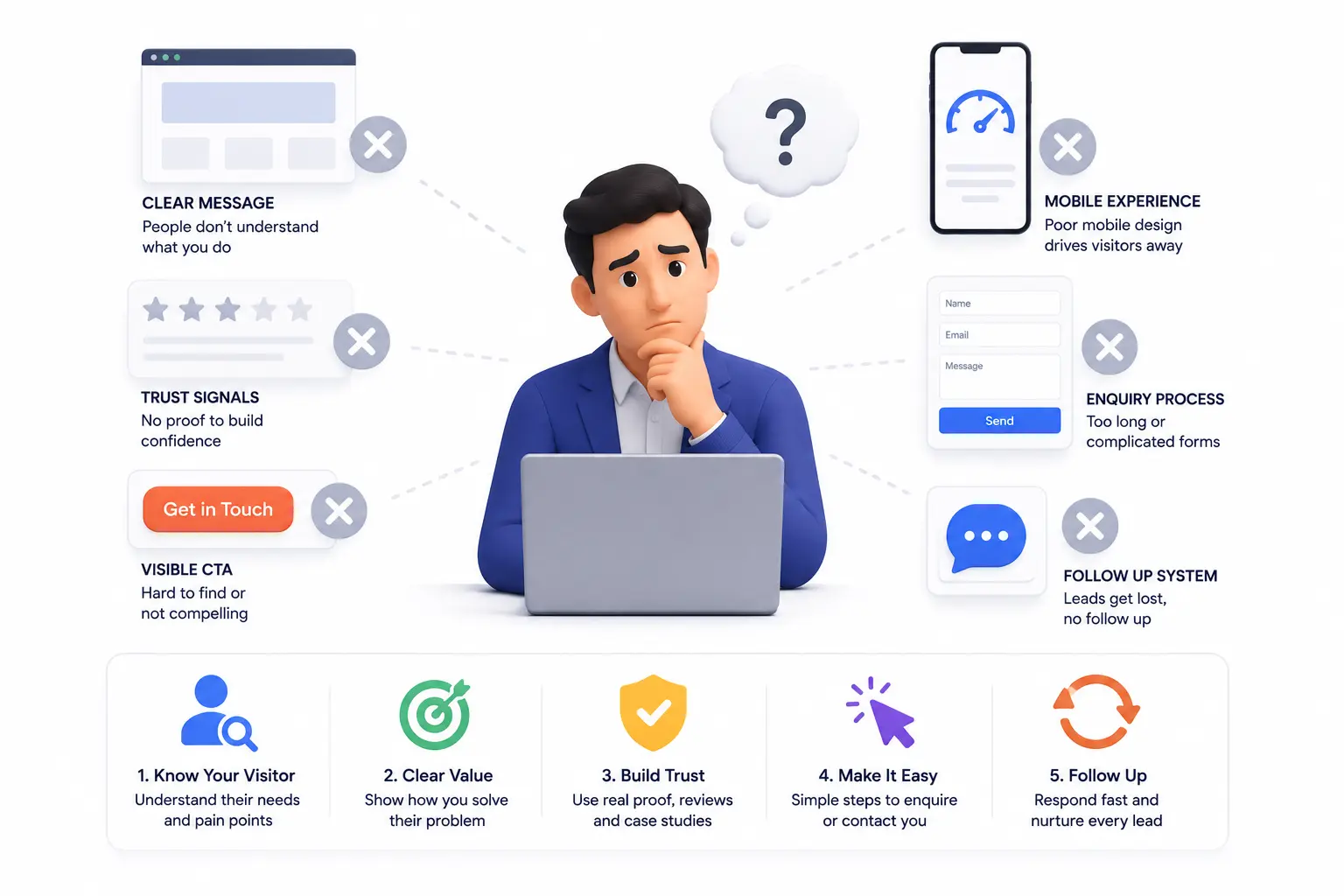
Here’s the part most people miss: the majority of visitors who leave without contacting you weren’t uninterested — they were undecided. And undecided visitors don’t make extra effort to get in touch. They need to be guided.
Most business owners treat a website as a place to present information, not a tool designed to guide a specific decision. The businesses that consistently generate enquiries from their websites usually have one thing in common: every important page has one clear, obvious next step, and that step is easy to take.
Timeline: What to Expect After Improving Your Website for Conversions
Simple fixes — adding a clear call to action, making your phone number visible, shortening your contact form — can be made in a single session and often show results within days, since each new visitor benefits immediately from the change.
Bigger improvements — rewriting service descriptions, adding testimonials, restructuring page layouts — take a week or two to implement properly. The impact builds over a few weeks as more visitors come through the updated pages. For most small business websites, a focused set of conversion improvements starts producing noticeably more enquiries within two to four weeks of consistent traffic.
What Happens If You Ignore This Problem
Traffic keeps arriving and quietly leaving. You spend money on ads or SEO to bring more people in, but the underlying leak means most of that effort converts into nothing. Visitors who were genuinely interested find a competitor’s site that made it easier to get in touch, and that competitor gets the business — not because they were better, but because they made the next step more obvious.
A Quick Action Step
Open your own website homepage right now and ask yourself honestly: if I landed here for the first time and didn’t already know this business, would I immediately know what to do next? If the answer is no, or even “maybe,” that hesitation is exactly what your visitors are feeling.
FAQ
My website has a contact page — isn’t that enough?
A contact page is important, but if visitors have to navigate to find it, many won’t. Calls to action and contact details should appear on key pages — especially the homepage — not just in one dedicated place.
Does adding a WhatsApp button actually help?
For many small businesses, especially in India, yes significantly. Most visitors are already on WhatsApp and find it far easier to send a quick message there than to fill out a form or make a phone call cold.
How many calls to action should I have on a page?
Usually one primary one per page. Too many competing buttons or links create confusion and can actually reduce the chance a visitor acts on any of them.
What if people visit but only read and leave — is that normal?
Some visitors are genuinely browsing and not yet ready to contact. But if the pattern is widespread and consistent, the site is likely not giving ready visitors enough of a push to act.
Does my website need live chat to convert visitors?
Not necessarily. A clear WhatsApp button, a visible phone number, and a simple short form together often perform just as well as live chat for small business sites, without the overhead of managing live conversations.
I added a contact form months ago and almost no one uses it. Why?
Check how many fields it requires, whether it’s visible without scrolling, and whether it appears on pages people actually visit. A form buried on a contact page with six required fields will see very little use regardless of traffic.
Key Takeaways
- Getting traffic and converting traffic are two separate problems — a site can do one well and the other poorly
- Most visitors who leave without contacting you were undecided, not uninterested — they needed a clearer next step
- A visible call to action, simplified contact form, and real trust signals are often enough to meaningfully improve enquiries
- Changes to calls to action and contact visibility can start showing results within days
- Ignoring this problem means consistently losing warm visitors to competitors whose sites make it easier to get in touch
Conclusion
Your website doesn’t need a redesign to start converting more visitors into enquiries. It usually just needs a clearer next step, contact details that are impossible to miss, and a contact form short enough that people actually complete it.
Start with the homepage. If a first-time visitor can’t immediately see how to reach you or what to do next, that’s where the fix begins — and it’s almost always simpler than it looks.