Every major redesign has an origin story. And almost every one of them starts the same way.
A decision was made early — which navigation pattern to use, how to structure the onboarding, where the primary action lives — and it felt right at the time. Nobody pushed back. The team moved forward. Screens were built. The product shipped.
Then the data came back wrong. Users dropped off at step two. The support team got flooded with “I can’t find X” tickets. The PM scheduled the redesign conversation.
In hindsight, the problem was obvious. But it wasn’t obvious when it mattered — when the decision was still cheap to reverse.
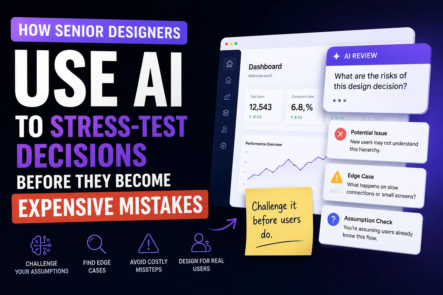
This is the problem senior designers have learned to solve with a technique called a pre-mortem. And AI makes it something any designer can run in under five minutes.
What a pre-mortem is and why it works
A pre-mortem is borrowed from product and engineering practice. Before committing to a decision, you imagine that the decision has already failed — then you work backwards to figure out why.
It sounds simple. The psychological mechanism behind it is powerful.
When you’re evaluating a decision you’re leaning toward, your brain naturally confirms it. You find evidence it’ll work. You dismiss edge cases. You weight the scenarios where your assumptions hold and discount the ones where they don’t. This is confirmation bias, and it operates below the level of conscious reasoning.
A pre-mortem forces a perspective shift. Instead of asking “will this work?”, you ask “how did this fail?” Framing it as a past failure — not a future risk — unlocks different thinking. You surface problems you were actively avoiding because the exercise doesn’t ask you to defend anything.
Senior designers who’ve shipped products that failed have often developed this instinct naturally — through the painful experience of watching a confident decision unravel in production. A pre-mortem is a way to get that same pressure-test without needing to learn it the hard way.
AI makes it accessible before you’ve accumulated that scar tissue.
The core prompt
Describe your design decision plainly, then ask the AI to argue against it:
🤖 AI Decision Review Prompt
Example:
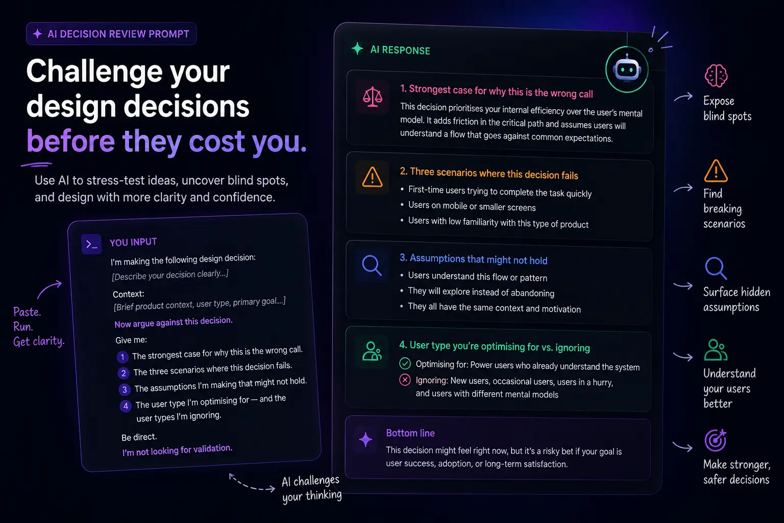
What comes back reframes your decision from every angle you weren’t considering. Not because the AI knows your product better than you do — it doesn’t — but because the act of structuring the question this way forces a systematic examination of your reasoning that confirmation bias otherwise prevents.
What this looks like on a real decision
Here’s an example. You’re designing a mobile app and you’ve decided to use a bottom navigation bar with five items instead of a hamburger menu.
Your reasoning: bottom nav is more discoverable, it’s the current iOS and Android convention, and it keeps primary sections always visible.
Solid reasoning. But run it through the pre-mortem:
The strongest case against bottom nav with five items: Five items at the bottom creates a choice paralysis problem — research consistently shows that more than four options increases cognitive load for new users who haven’t yet formed a mental model of the app. The discoverability benefit disappears if users don’t know which tab to tap first.
Scenarios where this fails: — The app’s primary use case is single-flow (users come in, do one thing, leave). Bottom nav optimises for multi-section apps. If 80% of sessions touch only one tab, the nav is visual noise that competes with the primary action. — On smaller screen sizes (still a significant portion of Android devices), five bottom nav items are cramped. Label truncation or icon-only navigation reduces clarity precisely for the users who need it most. — If the product roadmap adds a sixth section within 12 months, you’re either restructuring navigation mid-user-relationship or making tab six discoverable only through a buried “More” item — which is a hamburger menu in disguise.
Assumptions that might not hold: — That your users switch between sections frequently enough for persistent nav to be valuable. — That your five sections are truly equal in priority (bottom nav treats them as equal by default). — That your user base is on devices where bottom nav is the established convention.
User types you’re ignoring: Users accessing the app primarily from the web, where bottom nav is unfamiliar. Power users who navigate via gestures and don’t need the nav visible at all. First-time users in the first 60 seconds who don’t yet understand what the tabs represent.
None of this means bottom nav is the wrong decision. It might still be the right one. But you now know what you’re trading away, and you can design defensively — maybe four tabs instead of five, maybe a one-time tooltip for new users on the primary tab, maybe a tab order that front-loads the most common use case.
That’s a better decision than the one you started with. And it cost you five minutes.
Variants for different decision types
For navigation decisions:
💡 Navigation Decision Prompt
For information architecture decisions:
🤖 AI Prompt
For interaction pattern decisions:
🤖 AI Prompt
For scope and prioritisation decisions:
When to run a pre-mortem
Not every decision needs one. The signal for when to run it is the cost of being wrong.
Run a pre-mortem when:
- You’re making a structural decision that will affect many screens (navigation, primary layout, core interaction pattern)
- You’re choosing between two options and both feel defensible
- You’re working without user research and making assumptions about behaviour
- You’re about to present a direction to stakeholders and want to be prepared for the hardest questions
- Something feels right but you can’t fully articulate why
Don’t bother when the decision is easily reversible, visually cosmetic, or already validated by research.
The goal isn’t to second-guess everything. It’s to apply deliberate scrutiny to the decisions that compound — the ones that shape every screen that comes after them.
The instinct this builds over time
The most useful long-term effect of running AI pre-mortems consistently isn’t the individual decisions it improves. It’s the instinct it develops.
When you regularly ask “how does this fail?” and “what am I assuming?”, you start asking those questions automatically — in design reviews, in stakeholder conversations, when you’re looking at your own work at 11pm wondering if something is off.
That instinct is what separates designers who produce consistently solid work from designers who produce work that looks right but falls apart under real conditions.
AI accelerates the development of that instinct by giving you high-quality counter-arguments on demand, without needing a senior designer in the room to push back on you.
Published by ZywraStudio · zywra.com Follow on Instagram for daily design + AI tips: @ZywraStudio