There’s a habit that separates beginner designers from senior ones. It’s not creativity. It’s not how many tools you know. It’s not even how many hours you’ve spent in Figma.
It’s consistency — and consistency comes from having a system before you build anything.
The problem every beginner runs into

Picture this. You open a new Figma project. You’re excited. You create a home screen. It looks great.
Then you create the next screen. New page, new button. Then a card. Then another page — different font size this time. Different spacing. Different shade of blue for the primary button.
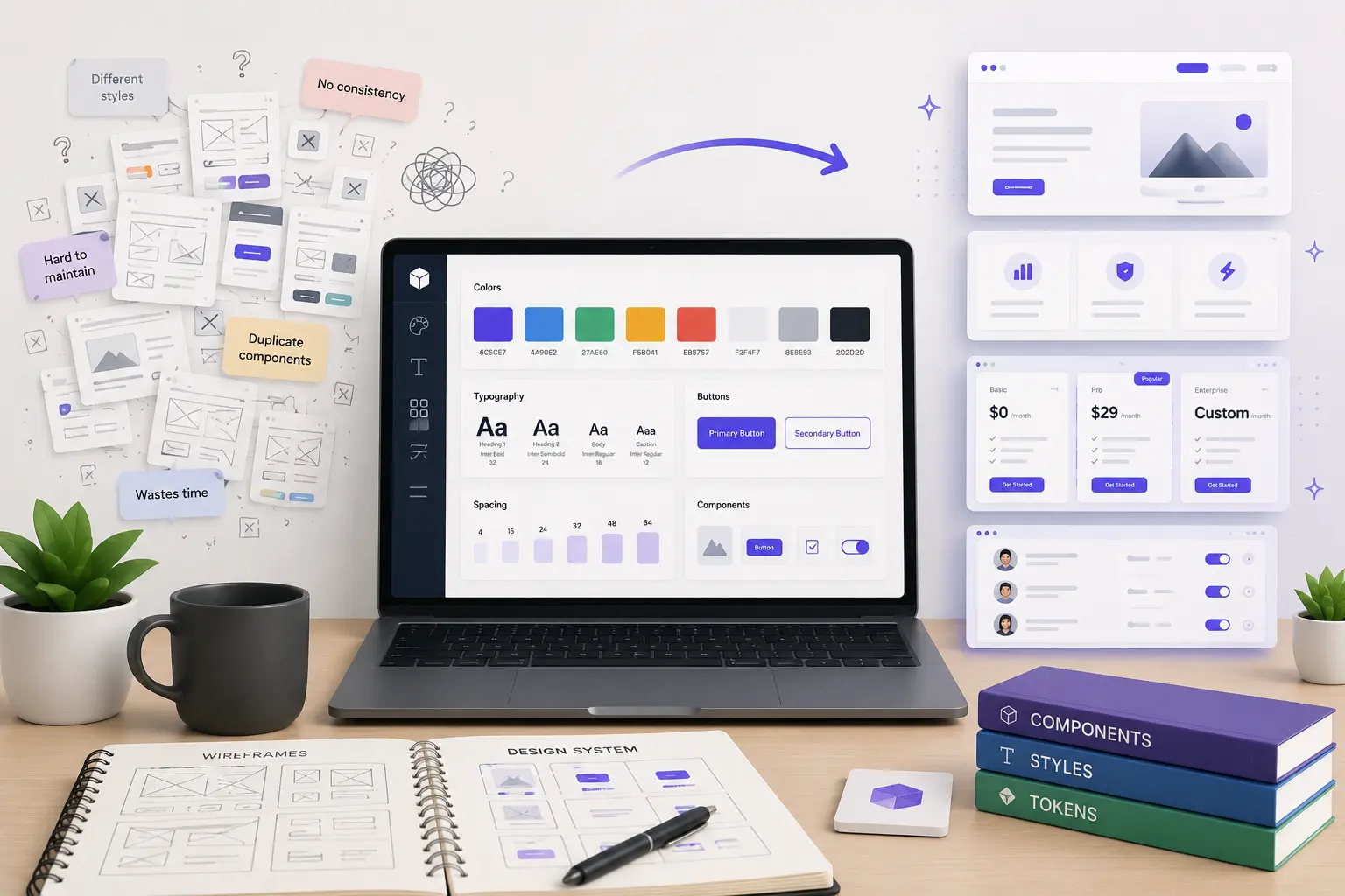
By the time you’ve built 10 screens, nothing looks connected. Your project feels like 10 different websites stitched together. The client notices. You notice. And fixing it means going through every single frame manually.
This is the most common trap beginners fall into — and it’s completely avoidable.
What professionals do differently
Senior designers don’t design every page from scratch. They build one system first, then use that system to build every page.
The difference sounds small. The results are enormous.
Here’s the workflow shift:
| Beginner | Senior |
|---|---|
| New page → new button every time | One button component, reused everywhere |
| Different font sizes per screen | 5 defined text styles, applied consistently |
| Colors picked by eye | Color system with named tokens |
| Fix every screen when client asks for a change | Update the system once, all screens update |
The 4 things your design system needs to start
You don’t need a massive, corporate-grade design system to get the benefits. You just need these four things before you start designing your first screen:
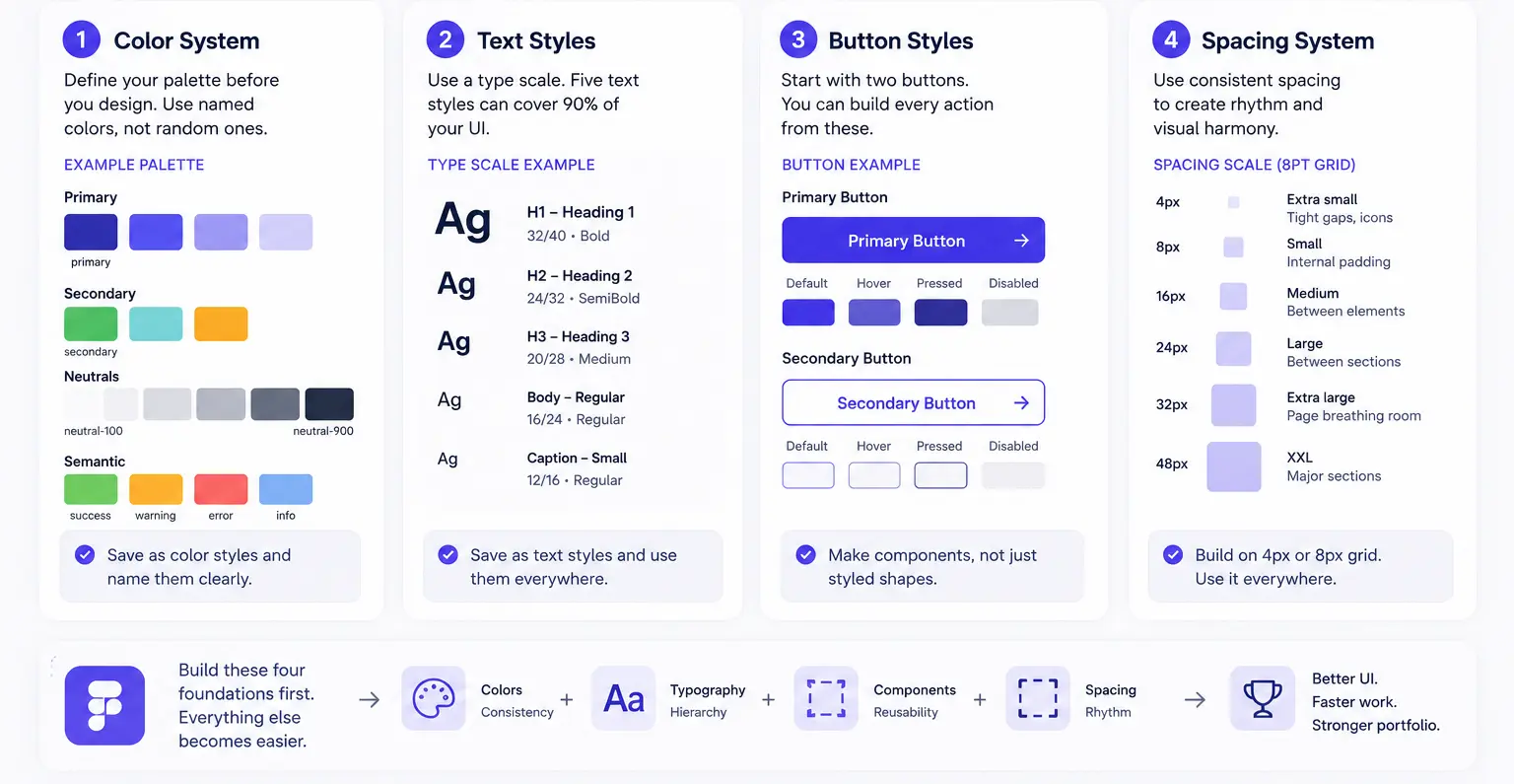
1. A color system
Define your palette before you touch a single frame:
- Primary — your main brand color. Used for buttons, links, key highlights.
- Secondary — supporting color for accents and badges.
- Neutrals — 3–5 shades of gray for backgrounds, borders, and text.
- Semantic colors — success (green), warning (amber), error (red).
Save every color as a Figma color style. Name them clearly: color/primary, color/neutral-100, color/success. Not just Blue or Dark Gray.
2. Five text styles
You need exactly five to cover almost every UI you’ll ever build:
- H1 — large hero text, 32–48px
- H2 — section headings, 24–32px
- H3 — card titles and subheadings, 18–22px
- Body — paragraph and label text, 14–16px
- Caption — helper text, timestamps, small labels, 11–13px
Save each as a Figma text style. Every piece of text in your project should use one of these — no freeform sizing.
3. Two button styles
Two is all you need to start:
- Primary button — solid fill, your brand color, used for the main action on any screen.
- Secondary button — outline or ghost style, used for supporting actions.
Build these as Figma components, not just styled frames. Components are the key: change the main component and every instance across your entire file updates automatically.
4. A spacing system
Base everything on a 4px or 8px grid:
- Extra small — 4px (icon gaps, tight inline spacing)
- Small — 8px (internal component padding)
- Medium — 16px (between related elements)
- Large — 24px (between sections)
- Extra large — 32–48px (page-level breathing room)
Use Auto Layout in Figma and set gaps to these values — nothing else. Your layouts will naturally look more intentional.
The LEGO analogy that makes this click
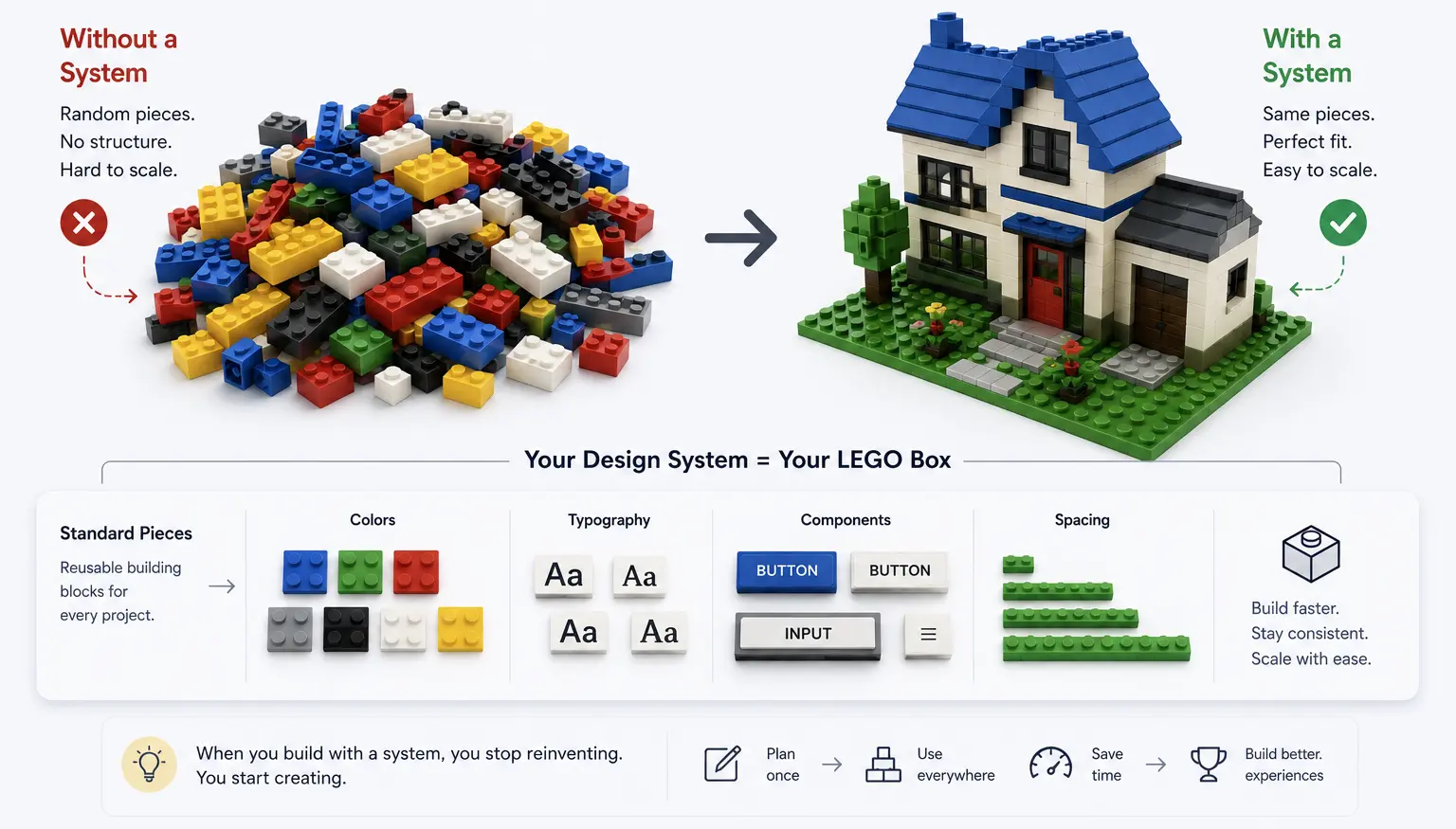
Imagine you’re building a LEGO house. Would you create brand new LEGO blocks for every single room? No — you’d use the same blocks everywhere, and everything would fit together perfectly.
A design system is your LEGO box.
When you have a defined set of pieces, you stop making decisions about the same things over and over again. You stop wondering “what shade of blue should this button be?” or “should this padding be 12px or 16px?” Those decisions are already made. You just build.
The result: faster work, more consistent output, and a portfolio that looks like it was designed by one intentional mind — not assembled from 10 different moods.
How to set it up in Figma (step-by-step)
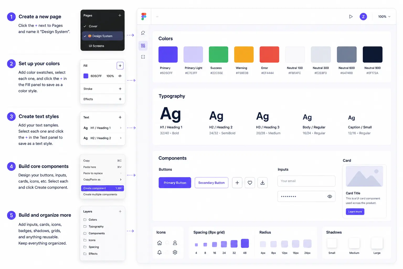
- Create a new page in your Figma file. Name it
🎨 Design System. - On that page, lay out your color swatches in a row. Select each one and click the
+in the Fill panel to save as a color style. - Add your 5 text samples in a vertical stack. Select each and click
+in the Text panel to save as a text style. - Design your primary and secondary buttons. Select each, right-click, and choose
Create component. They’ll appear in your Assets panel. - Build out any other shared elements — inputs, cards, icons — as components on this same page.
Now, every time you start a new screen: open the Assets panel (Option + 2 or Alt + 2), drag your components onto the canvas, and apply your saved styles. You’re designing with the system, not starting from scratch.
The moment that makes everything worth it
Here’s the best part. Imagine you’ve built 15 screens for a client. They come back and say: “Can we change the primary color from blue to purple?”
Without a design system: you open every frame, find every button, change every fill manually. 45 minutes. High risk of missing something.
With a design system: you open your Design System page, change the primary color style to purple, and watch every single screen update in real time. 30 seconds. Zero missed elements.
That’s the power of thinking in systems.
The real takeaway
The difference between a beginner and a senior designer isn’t talent. It’s the habit of making decisions once and codifying them, instead of re-deciding the same things on every screen.
Before your next project — even a personal one — spend 20 minutes building your system. Colors. Text styles. Buttons. Spacing.
Then use them everywhere.
Your work will look more consistent, your workflow will be faster, and when clients ask for changes (and they will), you’ll handle it in seconds instead of hours.
Published by ZywraStudio · zywra.com Follow on Instagram for daily Figma tips: #Zywrastudio