Wireframing has been a cornerstone of the design process for decades. Low-fidelity sketches. Grayscale layouts. Boxes where images will go. Text that says “headline here.”
The reasoning was always sound: iteration is cheaper when nothing looks finished. Get the structure right before investing time in visual design.
That reasoning was built on a constraint that no longer exists.
Why wireframing existed in the first place
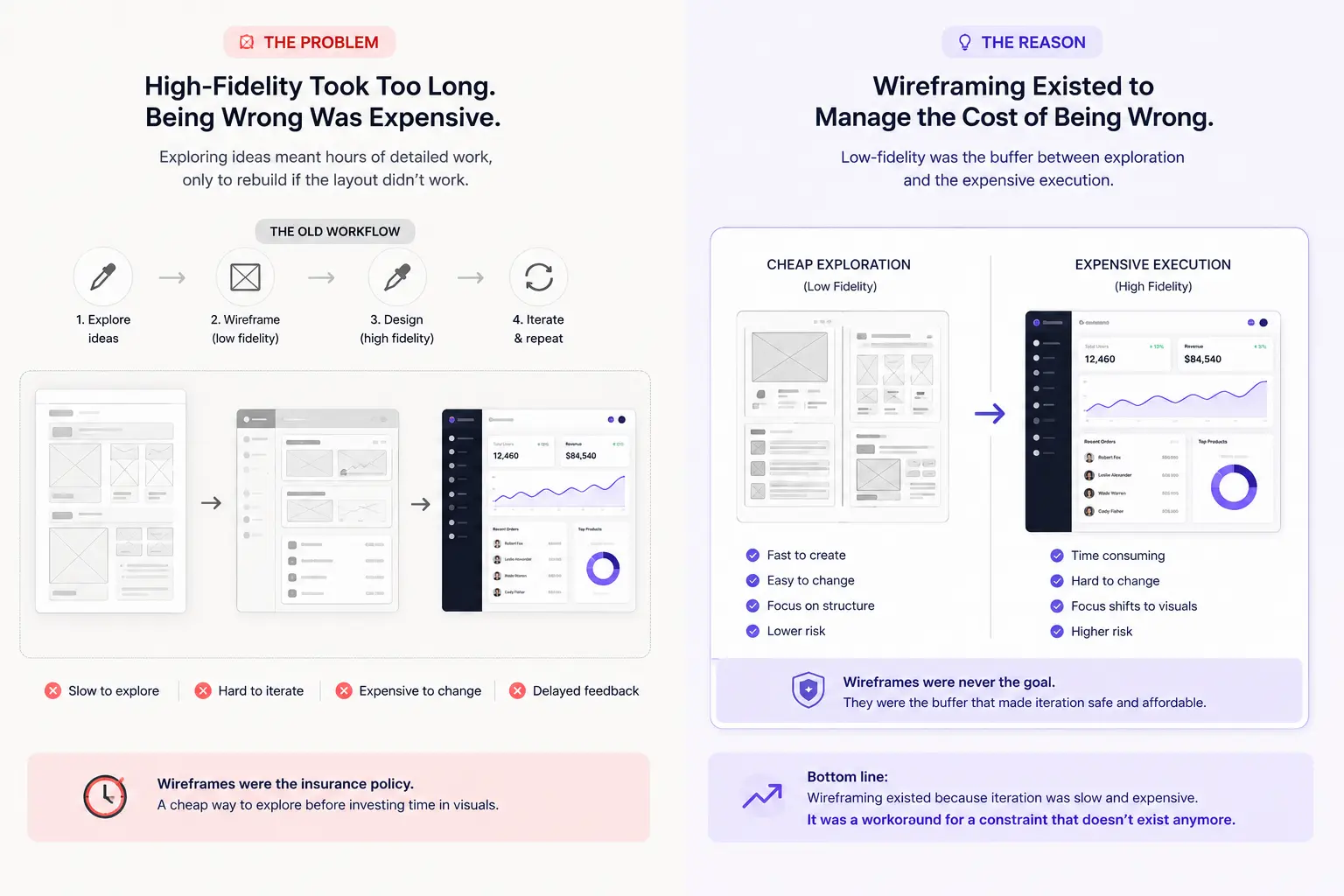
The wireframing phase was never about wireframes. It was about managing the cost of being wrong.
Going straight to high-fidelity used to mean hours of detailed work — color choices, typography, spacing, component polish — all of which had to be ripped apart and rebuilt if the layout didn’t work. So designers inserted a cheap exploration phase before the expensive execution phase.
Low-fidelity was the buffer. The insurance policy.
But that buffer was a workaround for a slow, expensive iteration cycle. When AI collapses the time cost of exploration to near-zero, the entire justification for a separate wireframing phase evaporates.
What the new process actually looks like
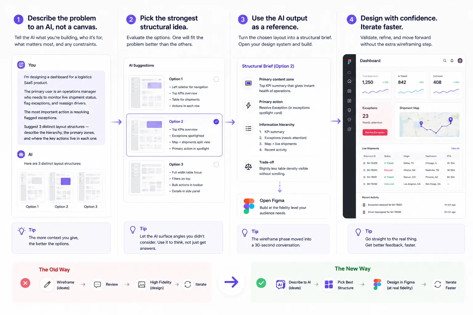
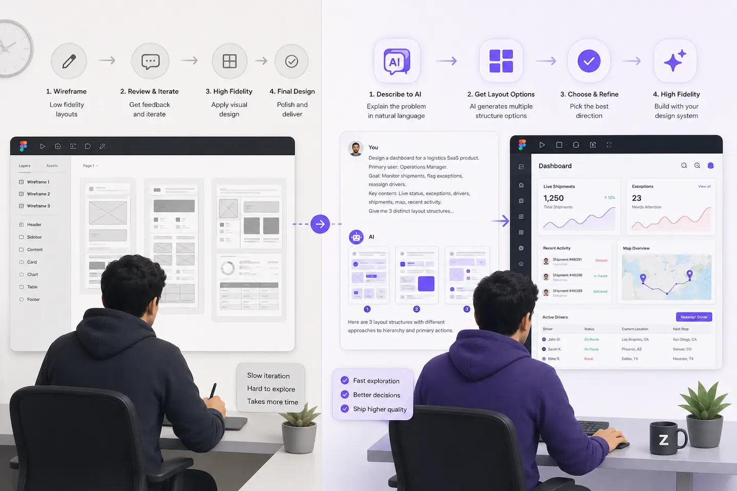
Here is a workflow that senior designers using AI are running right now — not hypothetically, but as a daily practice:
Step 1: Describe the problem to an AI, not a canvas.
Instead of opening Figma and drawing boxes, open Claude, ChatGPT, or any capable language model. Describe what you’re designing. Be specific about the user goal, the key actions, the content that needs to live on the screen, and any constraints.
A prompt that works:
“I’m designing a dashboard for a logistics SaaS product. The primary user is an operations manager who needs to monitor live shipment status, flag exceptions, and reassign drivers. The most important action is resolving flagged exceptions. Suggest 3 distinct layout structures — describe the hierarchy, the primary zones, and where the key actions live in each one.”
This takes 45 seconds to write. The AI returns three structured layout directions in under 10 seconds. Each one describes a different information hierarchy, a different primary action placement, a different approach to the content density problem.
Step 2: Pick the strongest structural idea.
Read each suggestion critically. One of them will feel immediately right for the user problem. One will surface an angle you hadn’t considered. One will be wrong but will clarify why it’s wrong — which sharpens your thinking.
You are doing the cognitive work of wireframing — evaluating structures, thinking about hierarchy, making decisions about primary vs. secondary actions — but you’re doing it faster and with more options on the table simultaneously.
Step 3: Use the AI output as a reference, not a deliverable.
Paste the chosen layout description into a Figma text frame or keep it open in a separate window. This is your structural brief. Now open your design system and start building directly at the fidelity level your audience actually needs to see.
The wireframe phase didn’t disappear. It moved from a Figma file into a 30-second conversation.
What this is not
This is not “let AI design for you.” The AI doesn’t make design decisions. It generates structural options quickly so you can make better decisions faster.
The judgment is still yours. Knowing which layout serves the user best, which hierarchy matches the mental model of an operations manager, which information density is appropriate for a monitoring dashboard — that is design thinking. AI can’t do that. You can.
What AI eliminates is the mechanical work of representing 3 layout options in Figma before you know which one you’re pursuing. That work was never design thinking. It was transcription.
The objection worth taking seriously
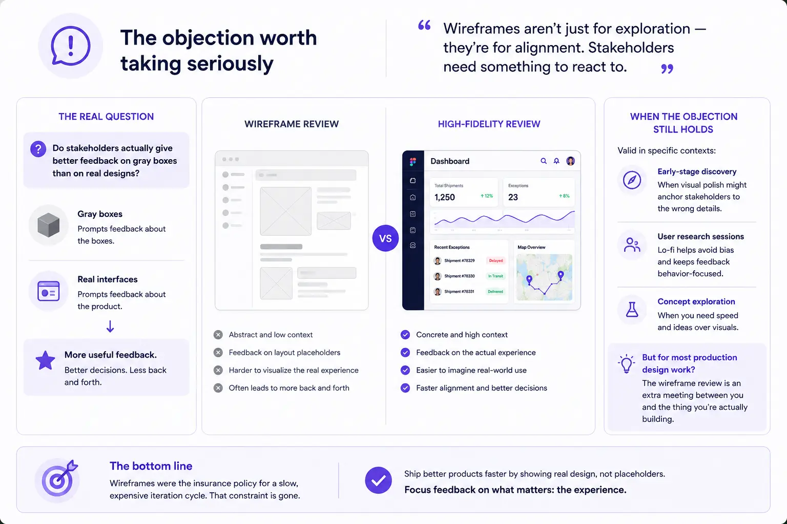
Some designers push back: “Wireframes aren’t just for exploration — they’re for alignment. Stakeholders need something to react to.”
This is real and worth addressing directly.
If your wireframes exist primarily to get stakeholder sign-off before committing to high-fidelity, the question becomes: do stakeholders actually give better feedback on gray boxes than on real designs?
In most cases, they don’t. Stakeholders react to what they see. Gray boxes prompt feedback about the boxes. Real interfaces prompt feedback about the product. The latter is more useful.
The counterargument holds in specific contexts — early-stage product discovery where visual polish might anchor stakeholders to the wrong details, or research sessions where you deliberately need lo-fi to avoid biasing participants. Those are legitimate uses. They are not the majority of wireframing that happens in practice.
For most production design work, the wireframe review is an extra meeting between you and the thing you’re actually building.
The shift that’s actually happening
The designers who are pulling ahead right now are not the ones using the most AI tools. They are the ones who have updated their mental model of where design thinking lives in the process.
Design thinking lives in the problem framing, the constraint identification, the user model, the hierarchy decisions, the system design. It does not live in the act of drawing boxes in Figma.
AI is revealing which parts of the design process were always cognitive work and which parts were always mechanical labor. Wireframing — at least the version most designers practice — falls mostly into the second category.
The designers who understand this distinction are delivering twice the output in half the time. Not because they’re cutting corners. Because they’ve stopped doing work that never needed to be done the way they were doing it.
A prompt to start with tomorrow
Here’s the exact structure I use before opening Figma on any new screen:
I'm designing [screen name] for [product type].

The primary user is [role] who needs to [core job to be done].

The most important action on this screen is [primary action].

Key content that must appear: [list 4–6 content elements].

Constraints: [any known constraints — nav structure, design system limits, etc.].

Give me 3 distinct layout structures. For each one, describe:
— The primary content zone and what anchors it
— Where the primary action lives and why
— The information hierarchy from top to bottom
— One trade-off this layout makes
Run this before every new screen for two weeks. The quality of your layout decisions will improve — not because the AI is making them, but because structuring your thinking this precisely before you touch Figma forces clarity you would have otherwise found halfway through a dead-end layout.
What’s next
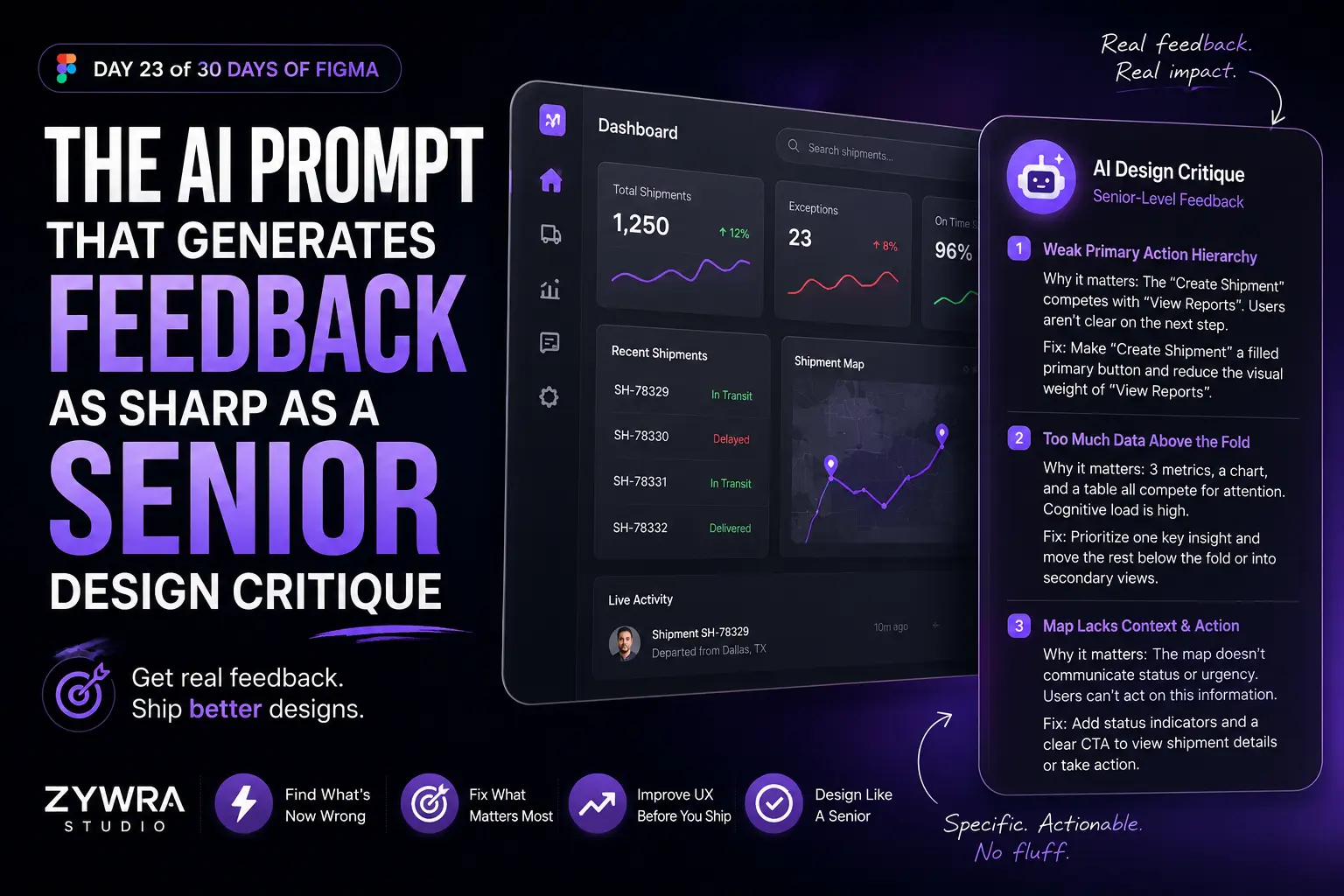
Day 23 covers the AI prompt pattern that generates design feedback as sharp as a senior design critique — and how to use it to pressure-test your own work before a review.
Published by ZywraStudio · zywra.com Follow on Instagram for daily Figma tips: #Zywrastudio