Most designers never get real critique.
Their teammates say “looks great.” Their clients say “I love the colors.” Their manager says “ship it.” And so they ship — with hierarchy problems nobody named, flow friction nobody caught, and UX assumptions nobody challenged.
Then users don’t convert. The PM asks why the onboarding drop-off is at step two. The redesign request comes six months later.
The root cause is almost never the visual design. It’s that the work never got pressure-tested before it shipped. And for most designers — especially those not working inside a large design org with dedicated design reviewers — that pressure-test simply doesn’t happen.
AI changes this. Not by designing for you. By being the senior voice in the room that most designers don’t have access to.
Why design critique is so rare in practice
Senior design critique — the real kind — is a specific skill. It requires pattern recognition across hundreds of screens, an internalized model of how users actually navigate interfaces, an understanding of hierarchy and cognitive load, and the willingness to say what’s wrong rather than what’s nice.
Most feedback designers receive in the wild doesn’t look like this. It looks like:
- “Can we make the logo bigger?”
- “I think the blue should be darker.”
- “My wife looked at it and she liked it.”
This isn’t critique. It’s reaction. And designing in response to reaction is how you end up with work that looks finished but doesn’t function.
The problem is structural. Senior designers who can give real critique are expensive, busy, or simply not part of your team. Design communities like Dribbble and Behance optimise for aesthetics, not for identifying functional problems. And asking colleagues for feedback creates social dynamics that push everyone toward encouragement.
So the gap between what designers receive and what they actually need remains wide — for most, for their entire career.
The prompt that closes the gap
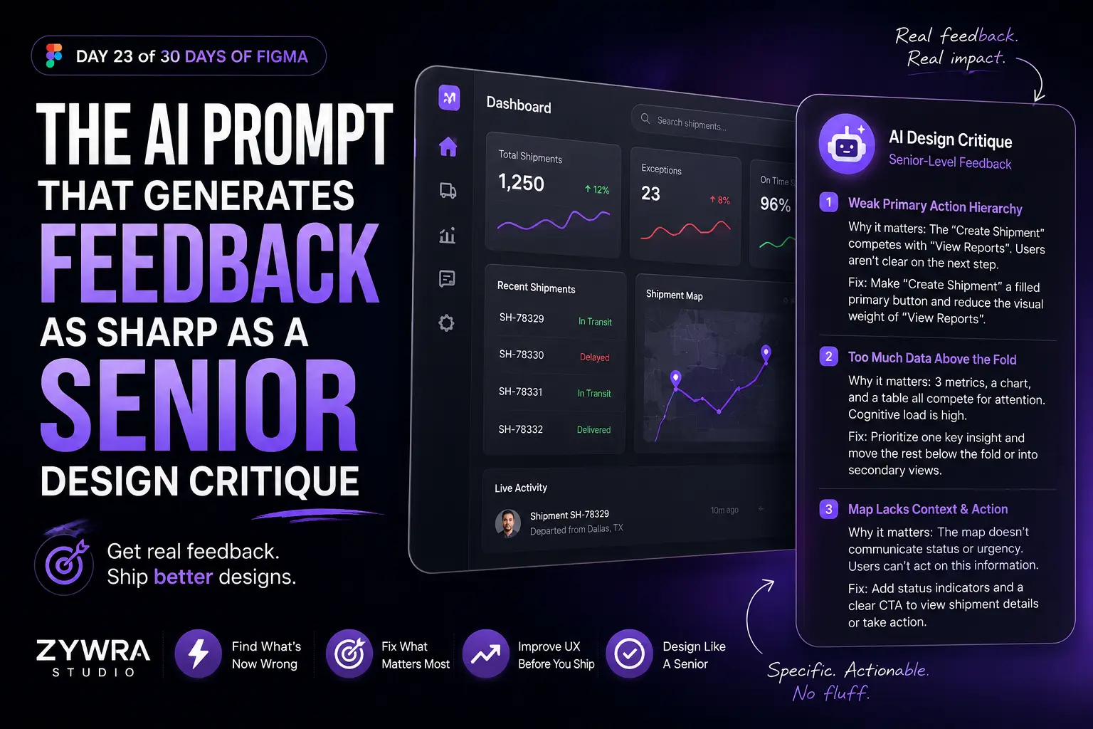
Here is the core prompt. Screenshot your design and give it to any capable multimodal AI (Claude, GPT-4o) with this:
You are a senior product designer with 10+ years of experience shipping consumer and SaaS products. You have strong opinions about hierarchy, information architecture, and user flow.

Review this screen and give me the 3 most critical issues — problems that would cause real friction for a user or undermine the primary goal of this screen. Be specific about what's wrong and why. Don't soften the feedback.

For each issue, tell me:
— What the problem is
— Why it creates friction or confusion
— One specific way to fix it
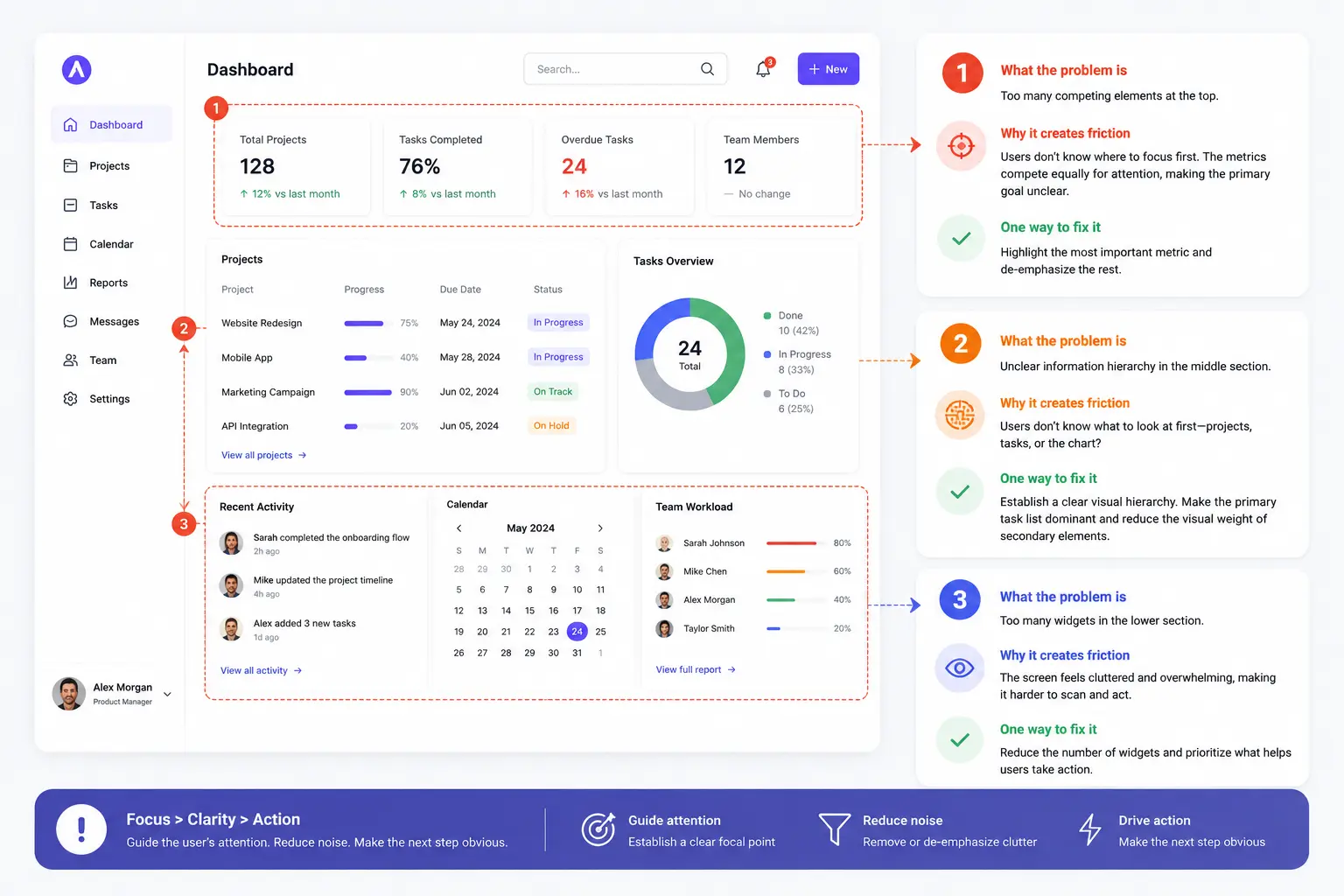
What comes back is not a compliment. It’s the kind of structured, pointed analysis you’d get from a good design lead — hierarchy problems you’ve looked past because you’ve been staring at the screen for three days, flow assumptions that don’t hold under examination, visual weight distribution that buries the primary action.
Why the prompt wording matters
Two things in the prompt above are doing critical work:
“Don’t soften the feedback.” AI systems are trained to be helpful, which in feedback contexts defaults to being encouraging. Without this instruction, you’ll often get a list that starts with what’s working before cautiously mentioning one or two concerns. That’s not useful. You need the hardest problems surfaced first.
“Be specific about what’s wrong and why.” Vague feedback — “the hierarchy could be stronger” — is useless. Specific feedback — “the primary CTA competes visually with the secondary action because they share the same size and color weight, so the user has no clear next step” — is actionable. The prompt has to demand specificity to get it.
Variants for different types of critique
The core prompt works well as a general review. But you can tune it to get targeted feedback on specific dimensions:
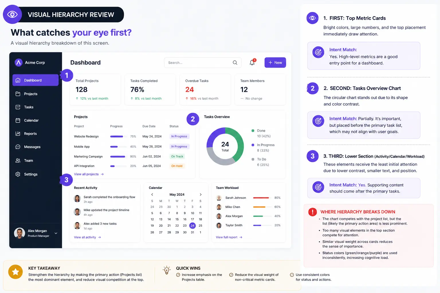
For information hierarchy:
Review this screen purely through the lens of visual hierarchy.

What does the user's eye land on first, second, and third?

Does that sequence match the intended user journey?

Where does the hierarchy break down and why?
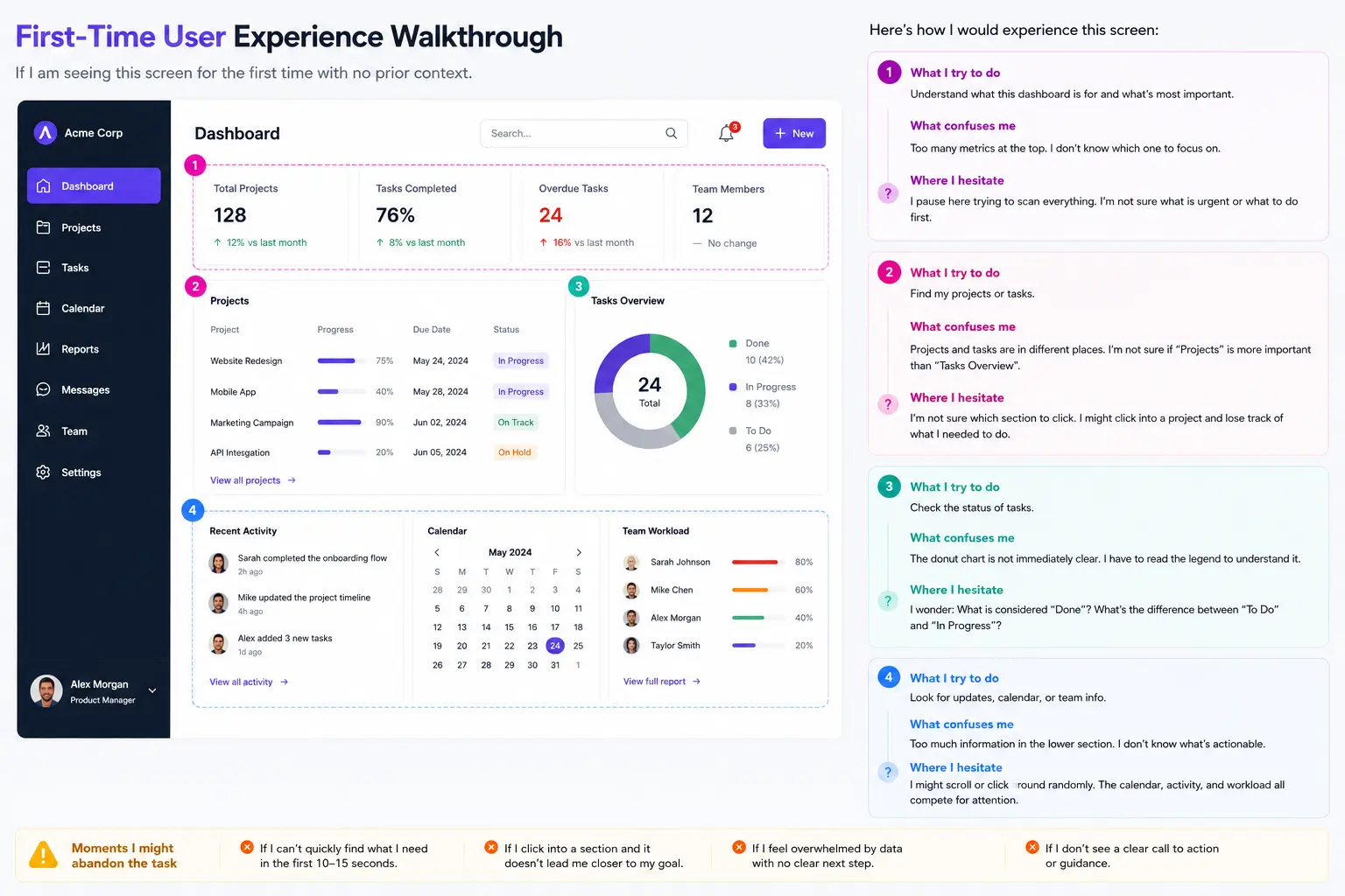
For user flow and friction:
You are a user seeing this screen for the first time with no prior context.
Walk me through what you would try to do, what would confuse you,
and where you would hesitate or abandon the task.
Be specific about the moments of friction.
For copy and clarity:
Review every piece of text on this screen.

Identify any label, heading, or CTA that is ambiguous, jargon-heavy, or that a first-time user could misread.

Suggest a clearer alternative for each one.
For competitive positioning:
This is a [screen type] for a [product category].

Compare the design decisions here against what you know about best-in-class products in this category.

What are the 3 biggest gaps between this screen and the standard a strong product in this space would set?
How to use this in your actual workflow
The highest-leverage moment to run this is not after a review — it’s the morning before one.
Before any stakeholder presentation or team review, screenshot every key screen and run it through the critique prompt. Spend 20 minutes reading the output carefully. Fix whatever you can. For the things you can’t fix in time, at least you’ve named them — which means you can address them proactively in the review rather than having someone else surface them as a surprise.
This does two things. First, your work is genuinely stronger walking into the room. Second, you demonstrate the kind of self-critical design thinking that distinguishes senior designers from mid-level ones. “I identified these three issues and here’s how I addressed them” is a different kind of conversation than waiting to be told what’s wrong.
The deeper shift this enables
Access to senior critique has always been unevenly distributed. Designers at companies with strong design cultures, large design orgs, or experienced design leads receive regular, high-quality feedback that shapes their instincts over time. Designers working solo, at early-stage startups, or in non-design-led companies often go years without it.
That gap in access has always meant a gap in growth. The designers who got good critique got better faster.
AI doesn’t fully close that gap — pattern recognition developed over a decade of shipping products is genuinely different from a model’s output, and the best design critique often involves understanding organizational context, user research, and business constraints in ways AI can’t access from a screenshot.
But it narrows the gap significantly. A designer using these prompts consistently will catch more of their own mistakes, develop sharper instincts about hierarchy and flow, and walk into every review better prepared — regardless of the quality of feedback culture around them.
That’s not a small thing.
The prompt to save
You are a senior product designer with 10+ years of experience.
Review this screen and give me the 3 most critical issues with
hierarchy, flow, and user clarity. Be specific. Don't soften the feedback.

For each issue:
— What is the problem
— Why it creates friction
— One specific fix
Screenshot your current design. Run it now. See what comes back.
What’s next
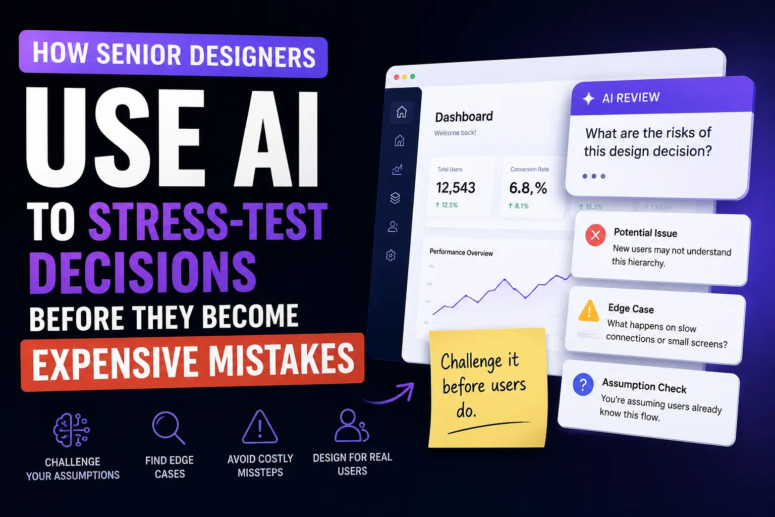
Day 24 covers how senior designers use AI to stress-test their design decisions before they become expensive mistakes — a pattern most designers only discover after their first major redesign.
Published by ZywraStudio · zywra.com Follow on Instagram for daily design + AI tips: #ZywraStudio